If you’re like most brands and businesses on Instagram, you use the platform to:
- Access a network of 1 billion users a month
- Maintain and grow an online following that will stay loyal to your brand
- Increase brand engagement and visibility
Instagram can be a great tool to use in your social media marketing strategy. But it’s smart to remember that the aesthetic of your Instagram feed can make or break your success on the platform.
A great aesthetic on Instagram inspires endless scrolling on your feed. That translates to huge exposure for your brand through likes, engagement, shares and follows.
Avoid the following mistakes to ensure that your Instagram aesthetic attracts and maintains the interest of your target audience.
Mistake #1 – Inconsistency
When you develop and design your Instagram feed, it’s wise to remember that people don’t follow you for what you’ve posted but for what they think the future of your content will be.
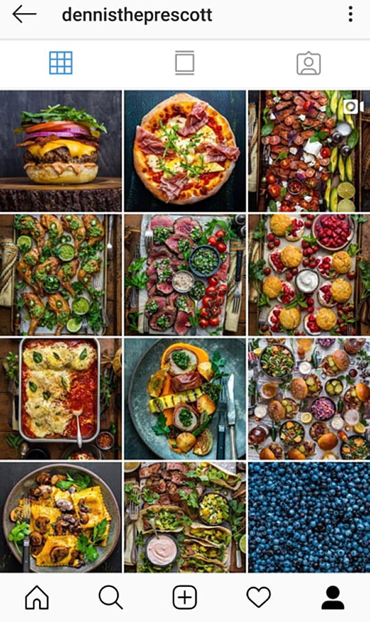
Variety is great – but when it comes to designing a high-impact Instagram feed make sure that you keep things consistent.
To do this you could keep an aesthetic guide. This is essentially a style guide for you and others on your team to refer to when posting and creating content and captions. Make sure you consider things such as:
- Editing apps and filters
- Brand tone of voice and fonts
- Colour schemes
Mistake #2 – Ignoring the Competition
We’re not trying to say that you should all-out copy the brands you admire. But stalking your favourite brands and the competition is a perfect way to discover the styles of feed that work well.
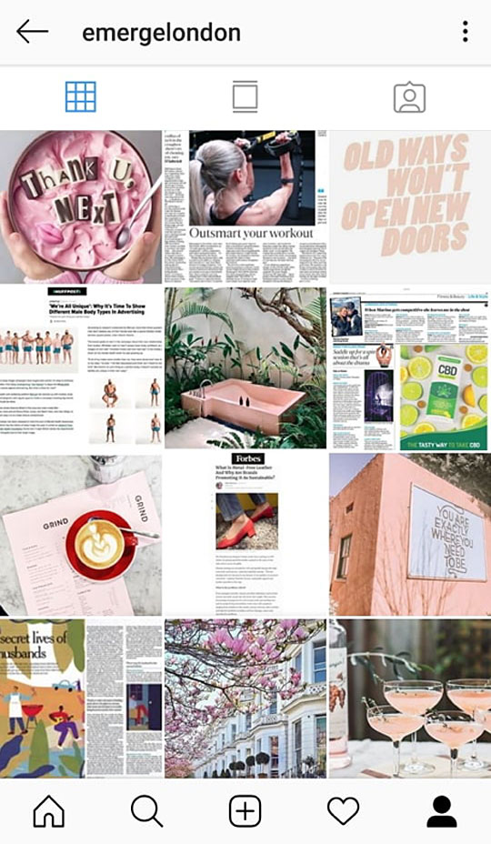
And it doesn’t have to be just the competition. Make a mood board of all of the accounts that inspire you, that are aesthetically appealing and that convey the kinds of messages that you aspire to with your brand.
Spend time on the platform, take lessons from the accounts you love and you’ll be well on your way to developing an effective aesthetic for your own brand.
Mistake #3 – Forgetting Your Audience
Remember that you’re aiming your account to your target audience. Just because you like that funny dog picture doesn’t mean you should include it in your feed if it doesn’t match the general feel of your account.

Be clear about who your customer is and then find the brands that they follow. What kind of accounts are they drawn to? What captions and images do they best engage with?
With your audience in mind create a tone which appeals to them through images and captions that you know they are looking for. Only then can you develop a call to action that has real impact.
Mistake #4 – A Poor Palette
While not essential, a great way to create consistency and fluidity on your feed is to pick an aesthetically pleasing colour palette. Ideally this will be the same colour palette as all your branded graphics – this way your Instagram feed will be seamlessly cohesive with your website and business.
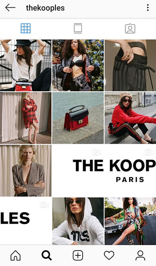
A consistent colour scheme will help make your Instagram feed look like a curated collection of images as opposed to a selection of mismatched photos thrown at a wall.
If you are taking your own photos, lighting conditions can make a real difference here. Photos that are consistently taken in the same light will keep images feeling similar to one another.
Apps can also be used to create this effect. It’s important to use the same filters and apps to edit your photos to avoid your feed looking jarring.
Mistake #5 – Forgetting The Bigger Picture
Remember that each photograph shows up as part of a grid. Forgetting the bigger picture can lead to a poor aesthetic that drives potential followers away.

Your Instagram gallery is a mixture of images which all relate to one another. Keep them along the same theme and try and make them tell a story. Splitting images can be an effective and dramatic way to do this. You may have seen this on some big brand’s feeds where each image can take up to six or nine tiles on each grid. This way it looks like one huge image to visitors on your home gallery.
While it’s important to keep some things similar, creating differences within the shots can also help your page look more appealing. Try shots that come from different angles or including the odd images with colours that pop out from the page.
It’s also worth noting that images with faces in them get 38 percent more likes. This infographic includes more useful Insta stats.
To make sure that your feed looks good before you post use apps like Planoly to plan out what you will be posting. These apps let you drag and drop your post layouts for up to 30 days ahead of time.
Mistake #6 – Not Editing Your Photos
One mistake you could be making is not editing your photos at all. There are a whole host of apps that make professionally editing photos taken on a phone extremely simple.
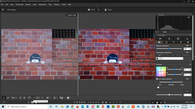
Some easy-to-use apps popular in the Instagram community include:
- Digital Photo Professional (as seen above)
- RawTherapee
- Canva
- VSCO
- Snapseed
- Picsart
Most apps have a set selection of filters, which will also make sticking to a branded colour palette that much easier.
Including GIFS on your Instagram is also a fun way to add an engaging twist to your content. These can be created and edited in apps like Boomerang. It’s rare to get a photo or video that looks perfect without a small tweak. Editing your content will help you create the desired aesthetic for your brand.
Mistake #7 – Forgetting Your Aesthetic On Instagram Stories
So you’ve developed your brand aesthetic and you’re maintaining it on your Instagram feed. Be careful it doesn’t all go out the window when you post an Instagram story.
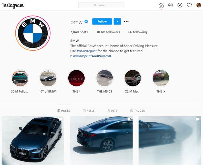
Followers should know that it is your story without seeing your profile in the corner of the screen. Maintaining cohesion will help you establish your brand and keep followers coming back for more content. To do this you should stick to the same colour palettes, image themes and fonts.
300 million users interact with Instagram stories daily so be sure not to underestimate the impact that they can have.
Some important tips are to:
- Create posts that look great vertically as this is how the vast majority of users will view them
- Use pre-designed layouts to make sure they are as visually appealing as your main feed
- Integrate brand messages
Wrapping Up
If you learn from the seven mistakes detailed here your brand is guaranteed to increase engagement and maximize on driving traffic to the places that you need it.
[Images – Main Image by rawpixel.com; other images from respective websites and/or social platforms]
Stefanos Bournias is a content marketing consultant that specializes in SaaS businesses. He’s worked with start-up founders, content managers and inbound marketers to deliver quality content that increases brand awareness, traffic and qualified leads.
Comments are closed.