
In a surprising move that has both captivated and bewildered the tech world, Elon Musk, the visionary entrepreneur behind SpaceX and Tesla, has orchestrated a radical rebranding of the social media giant, Twitter.
The iconic blue bird logo, which has symbolized Twitter’s identity for over a decade, has been replaced with a sleek and minimalist white stylized “X” on a captivating black background.
This transformation is a crucial step towards Musk’s ambitious vision of molding Twitter into an all-encompassing super-app, reminiscent of China’s multi-faceted WeChat platform.
Musk’s vision extends beyond a mere logo change; it envisions a comprehensive overhaul of Twitter’s purpose and utility. By aiming to evolve Twitter into an “everything app” called ‘X’, Musk is pushing the boundaries of what a social media platform can be.
This audacious endeavor isn’t without its challenges, as the rebranding has not only wiped out billions of dollars in market value but also stirred debates about the erosion of Twitter’s established brand equity.
The decision to part ways with the beloved blue bird emblem is both shocking and inevitable. On one hand, it involves relinquishing an iconic symbol that has ingrained itself into the collective consciousness of users worldwide. On the other hand, Musk’s determination to redefine Twitter’s role in the digital ecosystem necessitates such a transformative step.
Statistics underline the magnitude of this change. The rebranding decision led to a fluctuation in Twitter’s market capitalization, with estimates ranging from a loss of $4 billion to a staggering $20 billion. Industry analysts and brand agencies have raised concerns, emphasizing the challenge of rebuilding cultural resonance and linguistic consensus from the ground up.
The profound connection between Twitter’s corporate identity and Elon Musk’s personal brand further complicates the rebranding process.
Musk’s rationale for shedding the Twitter name is multifaceted. Not only does it overlap with the identity of his rocket company and one of his offspring, but it also bears associations with various other ventures, including an artificial intelligence startup and a fintech pioneer that evolved into PayPal.
The ambitious rebranding extends beyond the digital realm, as the new logo illuminates Twitter’s San Francisco headquarters, a tangible embodiment of the platform’s metamorphosis.
Elon Musk’s audacity reached its pinnacle when he crowd-sourced the design of the ‘X’ logo directly from Twitter users. His engagement and interaction with the platform’s community demonstrate a unique approach to branding.
By involving the users themselves, Musk has harnessed the power of collective creativity, perhaps laying the foundation for a more engaged and committed user base.
From Blue Bird to X: A History of Twitter’s Logo

Early Twitter Logos
Prior to its 2006 launch, Twitter underwent several logo iterations. The initial publicly presented logo displayed the eventual name “Twitter” in a soft shade of blue. The font, created by Linda Gavin, showcased a distinct rounded style. This logo took the form of a straightforward wordmark, employing a distinctive typeface where the letters were in small capital letters, tightly arranged without spacing.
The Blue Bird
In 2010, the now-famous blue bird, affectionately named Larry, made its debut, marking the inception of several subsequent redesigns. This avian symbol swiftly gained unmistakable recognition, cementing its status as a cornerstone of the Twitter brand.
Sporting a distinctive tuft of feathers atop its head, Larry boasted a light blue hue. Interestingly, Simon Oxley’s creation was procured from iStock for a mere $15. Since Twitter’s inception in 2006, this bird icon has been an integral element of the brand, gracing the logo from 2010 onwards.
The X Logo
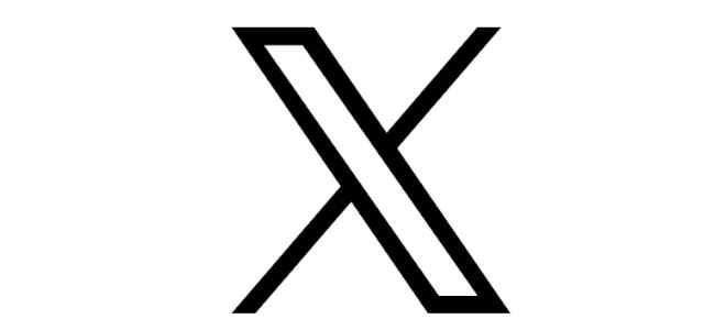
On Sunday, Elon Musk made an announcement revealing Twitter’s impending logo change – a shift from the well-recognized bird emblem to an elegant “X.” This new logo, a refined white “X” set against a black backdrop, now takes the place of the bird icon as the emblem denoting an account associated with a company employee.
Notably, Musk engaged in a form of collective creativity by seeking input from Twitter users themselves, urging them to contribute designs for the ‘X’ logo. He pledged that if a design caught his eye, he would adopt it as the new logo.
Musk expressed a preference for an Art Deco aesthetic, and in response, the Twitterverse flooded with various ‘X’ designs, with many utilizing AI image generators.
To select the final logo, Musk turned to his followers for ideas and ultimately appears to have chosen a design by @SawyerMerritt.
The new logo has been projected onto the company’s headquarters in San Francisco, and the X.com website URL redirects to Twitter.
Reactions To Twitter’s Logo Change
The change has sparked reactions from netizens, designers, and Twitter users, with some calling it an “appalling instinct for branding”.
User Reactions
The recent alteration has triggered a diverse range of responses among Twitter users. Certain individuals have lauded the fresh logo for its stylish and modern appearance, applauding its chic design. Conversely, there is a faction expressing their discontent and attachment to the previous bird logo. The platform has become a hub for users to articulate their opinions and perspectives regarding the new design.
Notably, a number of users have harnessed the medium to craft memes and digital artwork, effectively conveying their reactions to this transformation.
Designer Reactions
Design experts have also entered the discourse surrounding the logo alteration. A subset of designers has expressed criticism towards the new design, labeling it as “generic” and lacking inspiration. Conversely, another contingent has commended the logo’s simplicity and adaptability, highlighting its capacity to seamlessly conform to various contexts and platforms.
Netizen Reactions
Internet users, commonly referred to as netizens, have also chimed in on the logo transition. Among them, certain individuals have conveyed their perplexity and bemusement regarding the abrupt alteration. Conversely, others have voiced their disapproval of Musk’s choice to retire the bird logo, an emblem that has been an integral facet of Twitter’s identity since its inception in 2006.
Conclusion
This transformation isn’t limited to visual aesthetics. It’s a pivotal moment in Twitter’s evolution, reflecting Musk’s grand ambition to redefine how we connect and communicate. As the new ‘X’ logo takes center stage on the digital landscape and Twitter’s San Francisco headquarters, it marks not just a shift in branding but an inflection point in the company’s history.
While the rebranding carries substantial risk, it’s a testament to Musk’s boldness and his belief in pushing the boundaries of innovation. As the world watches and engages with this audacious transformation, only time will reveal whether the ‘X’ will mark the spot where Twitter’s revolution truly began.
[Recommended reading: 14 Steps To Grow Your Twitter Audience]

If you still fancy the X, previously called Twitter platform you can follow us there: x.com/socialmediarvl
[Image credits – Main Photo by Andrea Piacquadio; Twitter logos: Twenwy; other images or screen prints are from their respective websites and/or social platforms or articles.]

Purushottam is an accomplished Content Head at Emergen Research, where he spearheads the creation of insightful and engaging content in the dynamic realm of technology.