
The year 2014 saw the most promising crop of potential Facebook killers hit the market so far, but don’t hold your breath for a Facebook fall in 2015.
As ubiquitous as Facebook seems, one day it will surely tumble, to be replaced by something else just as it replaced MySpace and MySpace replaced Friendster earlier on. If/when Facebook loses its charmed life, it will likely do so because some new contender has a unique proposition that the average user likes enough to begin a mass migration.
This has not happened before, but three contenders in 2014 show promise, and I am here to review them.
Tsu, Ello and Seen
I joined Tsu a few months ago, and I joined Ello a couple months ago – then I discovered and joined Seen.is. Today I would like to report back on them, specifically as to how they compare to Facebook, to Google Plus and to each other for using and then for marketing.
Layout
There is only one word to describe Ello – sparse. If you have ever entered a large hall in a museum and there is a single monochromatic sculpture on a pedestal in the middle of the room, that is what Ello looks like. Sparser than Google Plus and much sparser than Facebook. One of the implications of this is that there is very little navigation, because, well, there just are not many places to go. Simple design, simple function. If you like things really simple, this might appeal to you.
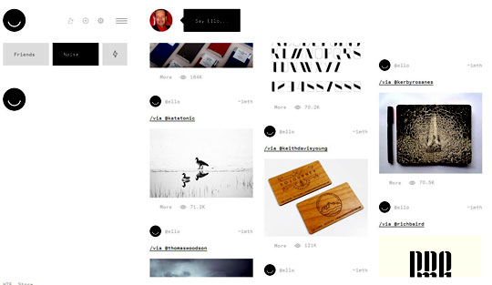
And there are no ads. In fact, the unique selling proposition that has propelled Ello’s success is that it will not sell your data or post ads. How will they make money? There are some ideas, including upgraded service for premium members. We shall see how far that flies.
Tsu (pronounced “Sue”, as in “A Boy Named Tsu”) is less sparse, resembling Facebook in basic design, but with fewer sidebars (more like Google Plus on the sparse-to-crowded spectrum).
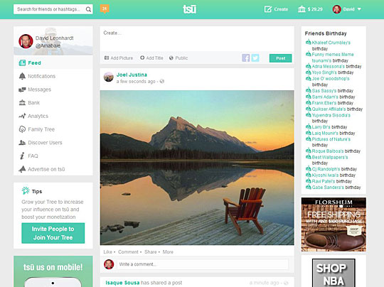
The navigation is fairly good, except that the only direct click-path from most profile pages and the main page to your important pages like “family tree” and “dashboard” is through the bank. There is some sense to this, given that Tsu’s unique selling proposition is that users and content creators should share in the revenues they generate, unlike Facebook.
TO DO: Make it easier to access key account pages, such as the dashboard, from any page on the site. The bank is cool, but it should not be the path to the dashboard or the family tree.
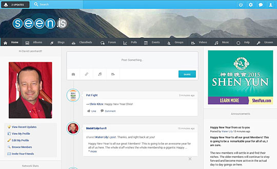
Seen.is is no more or less crowded than Tsu, so it is fairly easy to navigate. That being said, I can’t see who my friends are from my profile page, but I can from my home page. So, like Tsu, there are some navigation issues to tweak.
Both Ello’s and Tsu’s unique selling propositions have strong appeal for the same reason: Facebook has carefully constructed a reputation for trying to profit from users and not caring too much about their privacy and preferences – in other words, that they’ll sell your deepest darkest secrets to line their pockets.
To some degree Seen.is has a similar USP: “We are not Facebook”. I am pretty sure that won’t be strong enough to trip Facebook, though.
Features
A social networking site works best with features that enhance networking. Both Facebook and Google Plus have groups. Google Plus also has video-based Hangouts and you can organize people you follow into lists (called “circles”).
Neither Ello nor Tsu have either of these. In fact, the only feature Ello has is the ability to place people you want to follow into a choice of “friends” and “noise”. I guess that’s a stripped-down form of lists, an incredibly basic form (like Henry Ford’s offer to sell cars in any color, as long as it’s black). Tsu will need lists and groups in order to be taken seriously, since so much social discussion happens in groups. Right now, Tsu networking takes place mostly in (ironically) Facebook Groups and Google Plus Communities.
Surprisingly, Seen.is, the newest of the three sites, came storming out of the box already with groups enabled, as well as video and music uploads, albums (like Facebook and Google Plus), classifieds and polls. And a forum. And events (scheduling). And they must have noticed how popular Tumblr is, because they added blogs for each user.
Feature-wise, Seen.is leaves Ello and Tsu in the dust, no question. My one caveat is that I have not had the chance yet to use most of these features. However, the classifieds seem to be well-used and the help forum shows that there are glitches, but pretty much what you would expect for a website this complex.
Sharing
One of the key reasons people like social media is to share thoughts, photos, memes, links to their work, videos and other stuff on their timeline for others to view. On this count, Tsu wins hands down. Ello won’t grab an image from a link, and there is no way to post a video. In the noise section, posted images won’t display accompanying text, much like an extremely sparse Pinterest. That’s all a pretty big fail for me.

Seen.is makes it easy to post videos, images and sound (a nice little bonus if you are a recording artist) and links, and it grabs the image from the link. However, the images are tiny, very hard to view – you cannot read the text on many memes. Seen.is is simply not image-friendly, which won’t play well with most social media users (especially since I predicted that mixed media will be even more important in 2015).

Tsu displays pics with links and YouTube videos from links, and you can upload pics directly – nice, easy-to-view pics of a formidable size. Actually, I find it is more accurate at finding the main pic from a blog post than either Google Plus or Facebook.
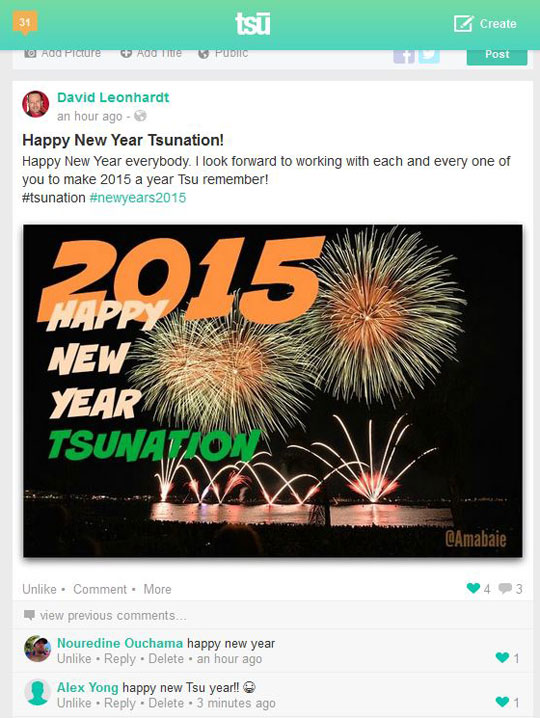
Posting is one thing, but navigating to an individual post is quite another. People like to cross post, so being able to post a link like https://www.seen.is/videos/65752/18153/lauralee-sings-in-limoges or https://www.tsu.co/Amabaie/21628822 into a Skype message or an email message or anywhere else is pretty important. On Tsu, there is a “more” link under each post, to “open” the post in a new window. In Seen.is there is a clickable link to some posts, like the one above, but most of my posts have no way to be seen individually. Ello lets you open individual posts, such as this one https://ello.co/amabaie/post/M2xwLq8i1i8jLsbm1vL_oQ easily enough.
Social media is about being social. You don’t just post things; you interact. At Tsu, I had no problem attracting friends, because lots of people want to be on Tsu, and I am constantly getting friend requests. At Seen.is, I have made a few friends, but it feels tougher. That might just be that I have put less effort into it and that it has received less overall publicity. Ello, on the other hand, has received lots of publicity, and I still cannot attract any friends or feel like interacting with them. It is not easy to interact and nobody I know seems to want to join Ello.
As for hashtags, they seem to be used only on Tsu. On Ello, I can’t even find a search function.
Promotion
Are any of these sites good for promoting your blog posts or other content? So far, Tsu shows promise. There are already plenty of bloggers and social media marketers active on Tsu, and it is starting to generate click-throughs, but not enough for a marketer’s dream. Tsu also allows sponsored content, which can get quite a lot of shares and comments. Whether there is positive ROI in sponsored content depends, of course, both on how much you pay and what the value of the views might be (just as it does on Facebook and Twitter).
Seen.is is too young to know if it is good for marketing, but it is showing early promise.
As for Ello, I really cannot see the value unless you are trying to reach the very niche communities that populate Ello, those being “artists and musicians”, as Mark Mars explains. The culture is anti-marketing and it is so sparse and stripped down that it is hardly even useful. And of course there is no paid marketing feature on a platform that promises to remain ad-free.
Summary
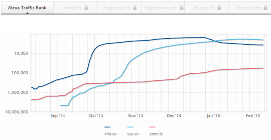
What all three platforms share is an enthusiastic early-adopter base, then a challenge to keep up the momentum. The traffic report above shows how each platform grows, then plateaus. If any of these are to become a serious threat to Facebook, they will have to find a way to kickstart a long-term, sustained growth of both users and usage.
To summarize, Seen.is is feature-rich and fairly easy to navigate. If it can attract enough buzz, it might be here for the long run, but it is plateauing early.
Tsu is the most user-friendly, but still somewhat limited in features. It has the most potential for long-term success, but if it does not provide the added features, it might not rise above its current plateau.
Ello…seriously?
David Leonhardt is a social media addict and a writer. He and his team can write your posts and promote them on social networks such as Google Plus, Twitter, LinkedIn, Pinterest, StumbleUpon, FaceBook and elsewhere.
Comments are closed.