One of the most interesting phenomena in psychology is death by multiple choice. When you give people too many options to pick from, they can get paralyzed and not know what to choose. That rule has been tested by marketers too.
In the days of direct mail, copywriters needed to find a way to sell products by showing pictures and writing text. They noticed an interesting pattern. When they used pictures of a product in multiple colors, the sales dropped. However, when they offered a single option, then the sales increased.
That was a profound discovery that has shaped how modern marketers look at their campaigns. This can also be translated to websites. If you have too many things happening at the same time, a visitor might become confused and go for another route than you intended. Follow this link for more info https://www.reuters.com/business/retail-consumer/second-none-fashion-resalers-bulk-up-capitalize-booming-sales-2021-10-28/.
For conversions, it’s important to make the process easy, simple, and straightforward. The first step is to analyze how your site looks to fresh eyes, and there’s always something to improve. Here are some of the things that could help you improve conversions down the line.
Use Testimonials
Here are some interesting statistics. More than 90 percent of internet shoppers refuse and hesitate when it comes to buying something on a site that has no reviews or testimonials. Everyone needs social proof when they want to buy something.
That can be achieved by promoting your internet presence and making your reputation widespread. Like it or not, the way people perceive your business is important. You should always include a couple of testimonials.
Some people think that they can just insert a link that will lead them to a third-party source like Google, Yelp, or TripAdvisor. That’s not the smartest move because you’re losing the visitor from your site. They need to see the evidence directly as a reminder that they’re not alone. That’ way, your conversion rates are going to increase.
Look At The Right Metrics

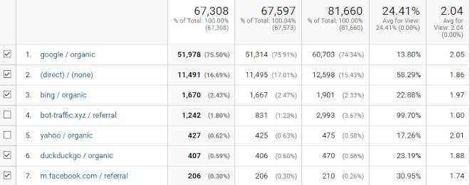
There are plugins that can measure pretty much everything on your site. If you haven’t used them, it’s time to install them and see what they have to offer. You can track everything from the number of pages they visited, what led them to your page, as well as how much time they spent looking at your content.
If you don’t understand what people are trying to find on your site, you won’t have a clue on how to improve. There are plenty of tools that will show you when visitors abandon forms, skip offers, and what they click on. You can also create a heat map to see what gets most used. This will make it easier to process, and you can look at the information with fresh eyes.
Put Your Offers To The Test
In some cases, it might feel like you’ve done everything correctly. You’ve added testimonials, your forms don’t get closed, and you have amazing content that people read completely. Well then, you have to double-check and see whether the service or product you’re offering is appropriate for your ideal customer.
Look at the demographics and see the type of people that are visiting. Also, search online if people are asking any questions about your services on Quora or similar sites. Additionally, you might want to switch up your offers. You can learn everything about the sales funnel here. Now, every single website has a free trial. That’s not going to work in the future, and it’s better to change it up.
Instead of offering a free trial for an entire week or month with a money-back guarantee, try to add more value and create a tangible product.
Here’s a great example of how you can think of it. If someone is a golf coach, they can only earn by the hour if they don’t make their services in the form of a product. Instead of teaching someone for a fixed rate, that coach can create programs.
That will include three sessions per week for a fixed price. They can also include specific goals that their clients can achieve. Try to look at your business from a different perspective and see how you can pack your services in a package that will make them more accessible.
If you’re an SEO company that creates content, you can make a package that includes a blog post, a video and an infographic. This will set you apart from your competitors, and you’ll be the first to do it in your niche.
This will make your value propositions clear, and you can check whether the sales are increasing or decreasing. For your final offer, have a clear explanation of all the problems that you can solve, and that will fix the entire situation.
Switch Up Your Call To Action
A call to action is a signal that tells your visitor that it’s time to do something. They either need to sign up for your newsletter or download a free eBook.

Doing these things requires effort from the side of the consumer, but you need to guide them through and make it extremely easy.
A lot of websites make the mistake of including only one CTA on the landing page and forgetting about it everywhere else. If you fall into that category, then you’re losing most of your customers. Add a CTA throughout the website and add it at the end of every page.
Using the same spot will signify that it’s easy to find. Plus, repeating something multiple times increases the chances of getting a hit. The crucial thing to remember is that your call to action needs to be visible at all times.
That makes it accessible and easy to locate when someone wants to go further in your sales funnel. Finally, you can also try out strategies such as A/B testing, where you can see what works better. It’s not always obvious to figure out what’s good and what’s not. Using this strategy will give you more information about which layout, content style, color, and headlines to use.
[Recommended reading: Top 5 Ways For Improving Conversion Rates]
[Images – Main photo from Pexels, CC0; woman on bed photo by Olya Kobruseva from Pexels; other images, video or graphics from their respective websites and/or social platforms]
