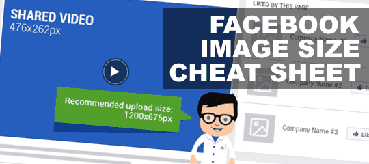
If you’re a social media expert, graphic designer or brand manager searching for a quick and easy cheat sheet for all Facebook image sizes and dimensions – look no further.
The below Facebook Image Sizes and Dimensions cheat sheet is the latest update by TechWyse in it’s series of infographics. The infographic will be regularly updated as Facebook makes new recommendations.
The Problem With Using Images On Facebook
Visual assets are crucial to engaging users on Facebook and growing your online presence. Whether it’s for your business, brand or client, ensuring you create a seamless experience for users across all of Facebook’s channels will ensure your online success.
However, this can be difficult as Facebook frequently updates its platform. The most recent updates include the design of business pages and dimensions for event response ads, however Facebook also recently updated the upload size and duration for video ads.
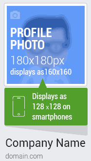
 Beginning with Facebook business profiles, the Facebook image sizes infographic below covers recommended dimensions for profile photos, cover photos, shared images, links and videos and app images.
You’ll also see how some images display differently on mobile. For example, your profile photo will display as 128 x 128 px on smartphones.
From there, you can find information for a variety of image dimensions for posts and ads across desktop and mobile. This includes page post links, offers and desktop apps, as well as page post images, events, like ads and videos.
It’s important to note that if a page post image is smaller than 470 x 246 px, it will automatically render as a thumbnail. In this section, you can see how images appear in the news feed, right column and on mobile.
The infographic also includes event response images – noting that if you neglect to upload the correct dimensions, Facebook will automatically choose the centre part of your image.
Lastly, for mobile app ads and promoted posts, it’s important to keep in mind that Facebook will disapprove posts with more than 20% image text.
Throughout the infographic you can also find character limits for page posts, ads, event information, video details and more. This makes it easy for you to speed up the process from image creation to sharing.
While Facebook is lifting the 20% limit of textual content on images, the platform still prefers images with text lesser than 20% of the image area. And they’ve also stated that images with excessive text may not enjoy the same organic and paid reach as those with optimal text ratio.
Facebook is one of the world’s largest social media networks, making it a crucial platform for anyone looking to build their online presence, or who is working to build the online presence of their clients. It’s targeting capabilities and easy-to-use platform are just a few benefits – but in order to get the most out of your experience on Facebook, ensure you’re populating each of its images with the correct dimensions to secure user engagement.
Check out the below infographic to learn more about the dimensions for each image on Facebook, and to get a variety of tips on how to ensure each image looks it’s best.

Please share this post and the Infographic to everyone you know who deals with Facebook (which is…err…pretty much everyone.) Share buttons are on the left 🙂
[Image credit: This awesome Facebook image sizes infographic was provided by TechWyse.]
Outreach Nerd, TechWyse
Comments are closed.