A lot has changed over the past decade in the manner that people consume information and interact with the world around them. Mobile is an absolute game changer that keeps dominating the digital world and, its transformative nature will increase even more in 2015 as more affordable devices will reach all the corners of the globe.
There are 2.078 billion social media active users and 1.685 billion active mobile social accounts.
according to We Are Social’s new Digital, Social and Mobile in 2015 -report. These numbers are not surprising as they follow a trend started years ago that is not giving any signs that it will slow down anytime soon.
Let’s see what implications these changes bring. What steps should we take to improve our social media marketing strategy to address the growing mobile trend?
Understand your audience and their mobile habits
First of all, we should go back to the basics: understanding who the customers are, what technologies they use and what motivates them. This means gathering data to ensure you know your user’s behavior patterns and how to leverage that knowledge.
Start by measuring your followers’ responses to your content. What are the most effective messages? What are the best times to post your updates for the highest reach? Gather as much information about your audience as possible, to be able to better serve them in forms of content and delivery.
This process is a trial-and-error game. There is no silver bullet or a recipe that will work for everybody. What we know for sure is that understanding your audience, combined with a brand storytelling approach is the key to effective marketing.
Make use of proximity and context marketing
Not long ago Facebook started testing a new feature called Place Tips that give users helpful information about their current location. For example, details from your company’s page will show up when people walk by your business location.
The social network also started testing Facebook Bluetooth beacons. These beacons send a signal to the user’s phone to help him get the right information at the right place and time. For example, when walking by a certain brand in a store, the user can get special offers right on their phone.
This approach of connecting the digital and physical realm opens the door to new ways of interacting with customers that may be in a rush.
Start implementing the mobile version of your website before it’s not too late
With the rise of BYOD (“bring your own device”), you should expect the mobile to become the primary screen where consumers will view online information. Don’t rely on the fact that your content will look as good as on a big, luxurious 23 inch screen. Most of your audience will probably read it on a mobile device the size of a palm.
You can check the analytics for the device types and the screen sizes your customers use to read your content. Using this information, test and optimize your website and social profiles for different screen sizes.
The way your website looks on a small screen is not enough to declare “mobile friendliness”. You need to also consider other factors such as page load times or image optimization.
Google offers you a wide range of tools to make sure that your website is mobile-friendly.
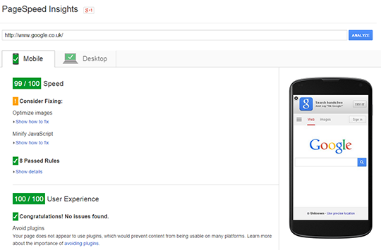
Page Speed Insights checks the speed of your website on both mobile and desktop platforms.

To get started, type in your website URL and click on Analyze. You will receive a speed “score”, a “user experience” score from 0 to 100 and the issues that you need to fix in order to improve your score.
The most simple way to check if your website is mobile-friendly is to search for it on a mobile device. Google recently added the “mobile-friendly” label for the search results that meet their guidelines. If your website doesn’t have this label you need to go further and use the Mobile-Friendly Test tool provided by Google to see what you need to fix.
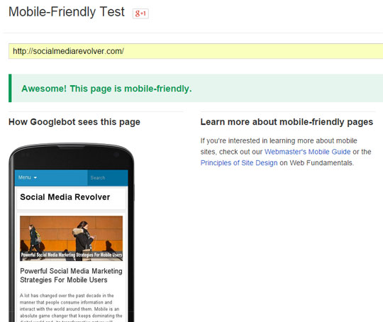
Google’s Mobile-Friendly Test works similarly with Page Speed Insights. You need to type the Website URL in the corresponding field and click on the Analyze button.

You will get a verdict whether the website is mobile friendly or not. If you get “Not-mobile friendly” you will also see the reasons for this verdict and what you need to fix. Google also shows you how Googlebot sees your page.
To emphasize even more the “before it’s too late” part, Google started sending mass notifications to webmasters who have websites that are not optimized for mobile viewing. These notifications are sent via Google Webmaster Tools and by e-mail and contain information about the mobile usability errors that, if not fixed, will cause the pages to be ranked “appropriately for smartphone users”.
And on February 26th we found out the reason for these warnings. Google’s Matt Cutts announced that it’s making 2 important changes to its algorithm for ranking the mobile search results:
“we will be expanding our use of mobile-friendliness as a ranking signal”: http://t.co/EOOPI12OgW #mobilerising
— Matt Cutts (@mattcutts) February 26, 2015
First, as expected, mobile-friendly websites will rank better in the mobile search starting April 21st, 2015. This means you have a few months to prepare your website and follow the mobile guidelines.
Second, starting right now, apps that are indexed by Google will rank better in the mobile search results. Here you can learn more about how to get your apps indexed by Google.
Optimize your social profiles for mobile viewing
Notice the differences in displaying the information on mobile versus desktop to know what to focus on. For most of the social networks, you need to have an amazing header image and a brief description, these being the first things a visitor sees.
On Facebook, right under the “About” section you will see the “Videos” and “Photos” sections. So if you want to have a certain post as high as possible you need to pin it and it will appear above the “Photos” section.
Make your posts stand out on any screen size
To make your posts stand out on mobile screens, a good rule of thumb is to add images. Visual consumption is increasing especially on mediums like phones and tablets, regardless of platform.
On Twitter, for example, in a sea of text messages, a quality image would stand out and captivate your readers’ attention.
Use analytics to know the best times to post for mobile users
Measure your users’ behavior to identify the best window of opportunity to ensure the messages get seen. Maybe your users are more likely to browse social media in the morning while commuting, or late in the evening while in front of the TV. Test different scenarios and see what works for you.
[See related post: The Secret Of Timing In Social Marketing]
Don’t share your content on all the social accounts at the same time. Mobile users rely on notifications to keep in touch with everything social. If you broadcast your content on all the platforms at the same time you can easily become intrusive and annoy your followers.
Monitor your mentions on social media
Use social listening to join conversations. There are many tools that you can set up to notify you when your brand is mentioned. This strategy will help you boost engagement and create meaningful relationships with your clients or prospects.
Wrapping it up
2015 will continue the mobile growth trend that we’ve been used to for almost a decade. More and more consumers access their social accounts using mobile devices. So, understanding their usage patterns is critical for an effective social media marketing.
Content marketing will be re-engineered to integrate both responsiveness and more visuals with minimalistic text for better mobile user experience. The need for a personal approach in social conversation will rise, as more customers expect a better response time from the companies they engage with on social media.
[Main image: ISO Republic, Enrico Essl]
Zoe Summers is an experienced Social Media Consultant and Co-Founder of Mass Planner, a social automation software. If you liked this article check out her blog here.
