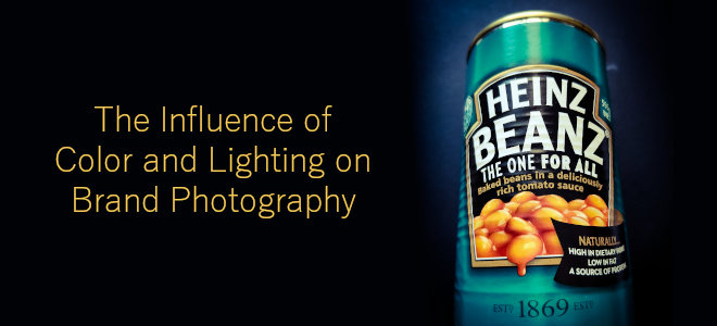
As the saying goes, a picture is worth a thousand words — but it’s worth far more than that in the realm of business branding and marketing. A single photograph can define your brand, attract customers, and affect consumer purchasing decisions.
Color and lighting have significant effects on how your company communicates its brand identity and speaks to consumers. Learn more about how color and lighting affect brand photography and consumer intentions.
What Is Brand Photography?
Knowing more about brand photography will help you understand why color and lighting are so essential. Brand photography includes the images that shape your brand’s identity. They may be images of products, employee headshots, lifestyle photos, or others. They represent the brand and display its personality through specific lighting, color, backdrops, and more.
How Brand Photography Helps
Brand photography creates visuals that help your brand stand apart from the competition. The photos can provide the following benefits:
- Develop your brand by introducing potential customers to your company’s personality, values, and passion.
- Provide a visual identity for your brand, making it easier for consumers to remember.
- Create a positive first impression.
- Increase views on social media posts, blog posts, your website, and more by making them more eye-catching and interesting to read.
- Show how the product works in real-world applications.
The Power Of Color
Color has a significant impact on how people see the world. It can affect emotions, and those emotions impact purchasing decisions. According to recent data, color can improve a brand’s recognition by as much as 80%. It is also a driving factor in why consumers choose one brand or product over another.
Countless brands use color to persuade consumers to purchase their products or services. Color psychology explains the link between colors and emotions and how those colors affect human behavior. Color psychology has probably affected your purchasing decisions without you even knowing.
The following are several of the most popular colors in branding and the emotions they evoke:
- Red: Passion, energy, strength, excitement, fearlessness
- Blue: Trust, dependability, loyalty, serenity, logic, security
- Yellow: Kindness, optimism, creativity, happiness
- Orange: Courage, kindness, friendliness, confidence, energy
- Green: Nature, health, freshness, hope, prosperity, growth
- Black: Elegance, authority, sophistication, security, power
- White: Purity, simplicity, cleanliness, freshness, sophistication
Red is one of the most popular colors for advertising because it is emotionally charged and intensifies consumer reactions. Coca-Cola, Target, Netflix, and Nintendo are a few major brands using red in their marketing. Brands like McDonald’s, Post-it, and IMDb use yellow for its kind, cheerful, creative qualities.
You’ve probably spotted grocery stores such as Whole Foods and Fresh Market choosing green to signify freshness, and financial institutions like Chase and PayPal using blue to evoke feelings of trust and security. Color psychology plays a significant role in consumers’ everyday lives. Harnessing its power can help your brand photography succeed.
The Power Of Lighting
Lighting has a similar effect on your customers and potential customers: It can project positive or negative emotions, set a mood, and encourage the viewer to feel how you want them to feel.
Soft lighting tends to be subtle and less intense than hard lighting. The product or other subject appears more playful in softer lighting. At the opposite end of the spectrum, backlighting and hard lighting create dramatic, shadowy effects that create feelings of intensity, mystery, power, and wonder. You may see this kind of lighting in ads for luxury cars, watches, or colognes.
Certain types of lighting can highlight a product more clearly, so your consumer can’t get distracted by other elements in the picture. For example, rim lighting emphasizes the product’s shape, separating it from the background. Broad lighting highlights one side of the subject or product, and short lighting highlights the farthest side of the product.
Like strategic use of colors in your photographs, your choice of highlighting can provoke different emotions, such as happiness, optimism, or security. You can use lighting to create a fun, approachable image or one of sophistication and thrill — it all depends on your brand and the identity you want to embrace.
Typically, the most effective brand photos are intriguing but well-lit and clear. The goal is to leave a lasting impression on your potential customer while reflecting your brand’s values in the most positive way.
Consider Hiring a Professional
Mastering brand photography on your own is not easy. There’s a reason this is often a job best left to a professional. Hire a qualified business photographer to get the job done right the first time. An expert can save you time and money and is already equipped with the tools and knowledge to help you succeed.
Find out more about how lighting and color influence brand photography and the overall success of your company in the accompanying infographic.

[Recommended reading: How To Use Stock Photos Without Getting In Legal Trouble]
[Image credits – Main image: Foap; other images, infographics or screen prints are from their respective websites and/or social platforms or articles]

Jonathan Young is a Los Angeles based commercial photographer who creates clean and inviting images of people, food, and products that help to position them at the top of their genres.
